This is the 3rd scrapbook I created using the cute girl collection by Crate Paper. If you haven’t already seen part 1 of this scrapbook you can check it out here: Cute Girl Scrapbook. All three scrapbooks were made using the cute girl collection of paper, however I’ve also included bits and pieces from Maggie Holmes bloom collection.


I love the front cover of this mini album. The corners have been distressed with Tim Holtz ink and all the embellishments look 3D because they pop out from the page. There is so much cute packed into one little album. Check it out!
If you are interested in making a mini album like this one, you can find information on how to make the book cover and binding on my scrapbook page.
Here are the dimensions of this book: the front and back cover measure to 8” tall by 6″ wide. So you should cut your cardboard to 8 1/4″ x 6 1/4″. The binding is 8″ x 3 1/2” so once you add your 1/4 inch it comes to 8 1/4″ to 3 3/4”.
A cutting board with measurements is a must have for these scrapbooks. When I started making these 3 years ago, I just used a ruler and scissors. Once I bought the cutting board, it completely transformed my projects! I highly recommend purchasing one.
Page 1:
The first page has a waterfall layout that opens up to the right. You can see this illustrated in the photos below. Each page is about an inch apart to reveal a small section of the page under it.


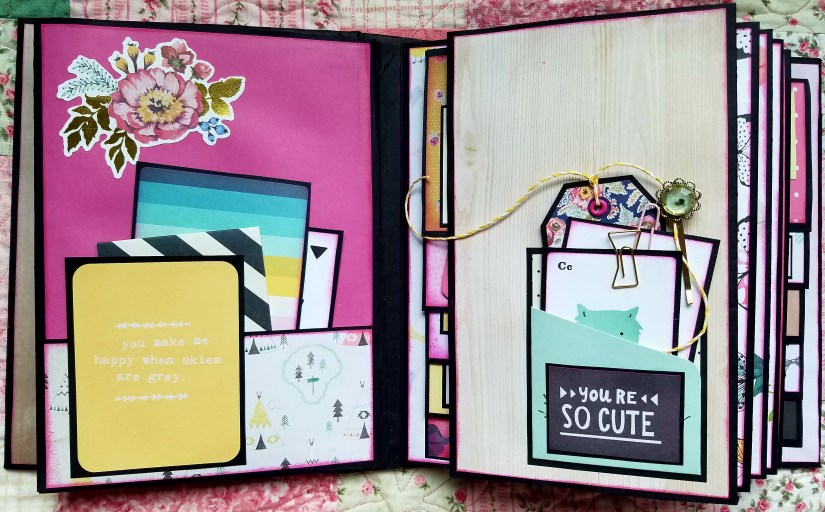
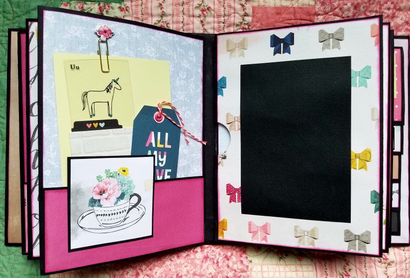
Page 2:
Looking at the left hand side of this photo below, you can see the back of page 1. Here I put a pocket to hold journal cards or photo mattes. Anytime I put a pocket to the bottom of a page like this, I will usually add a card to the face of it. It’s just a fun way to add some color and shape to the page. It also helps to hold all your journal cards and photos into place.
On the right hand side, you see the beginning of page 2. This page has a tiny pocket at the bottom. This page actually opens up to reveal. . .
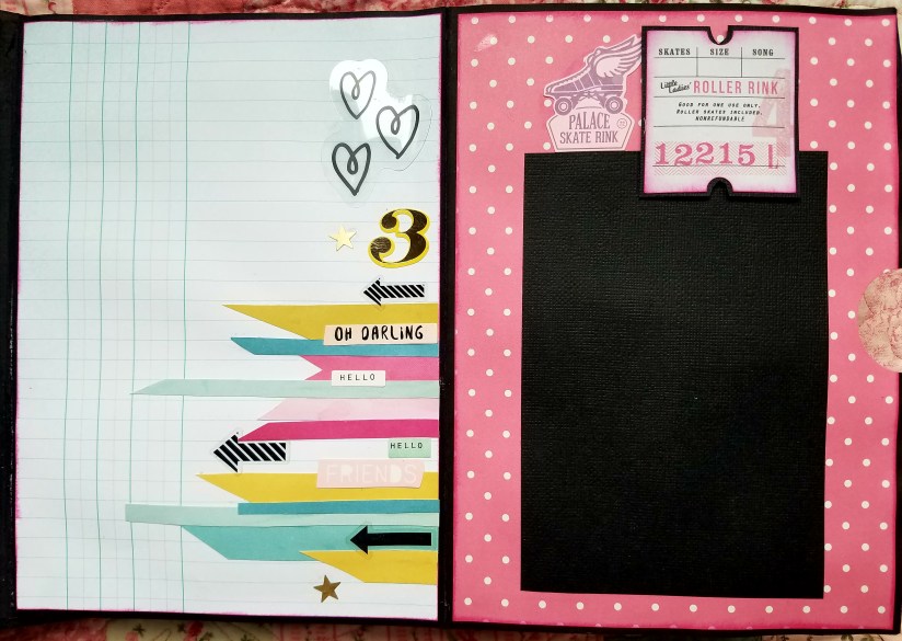
This page here. Which has another waterfall layout, only going down this time. Then to the right of it, a spot for a photo. 


Page 3:
I did this page much like the one just before it. Flip this page open and. . .
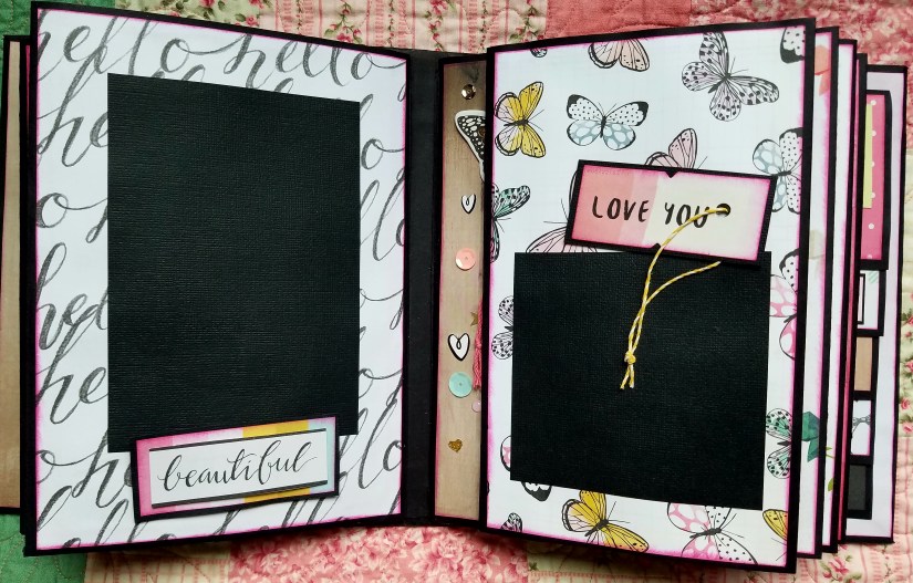
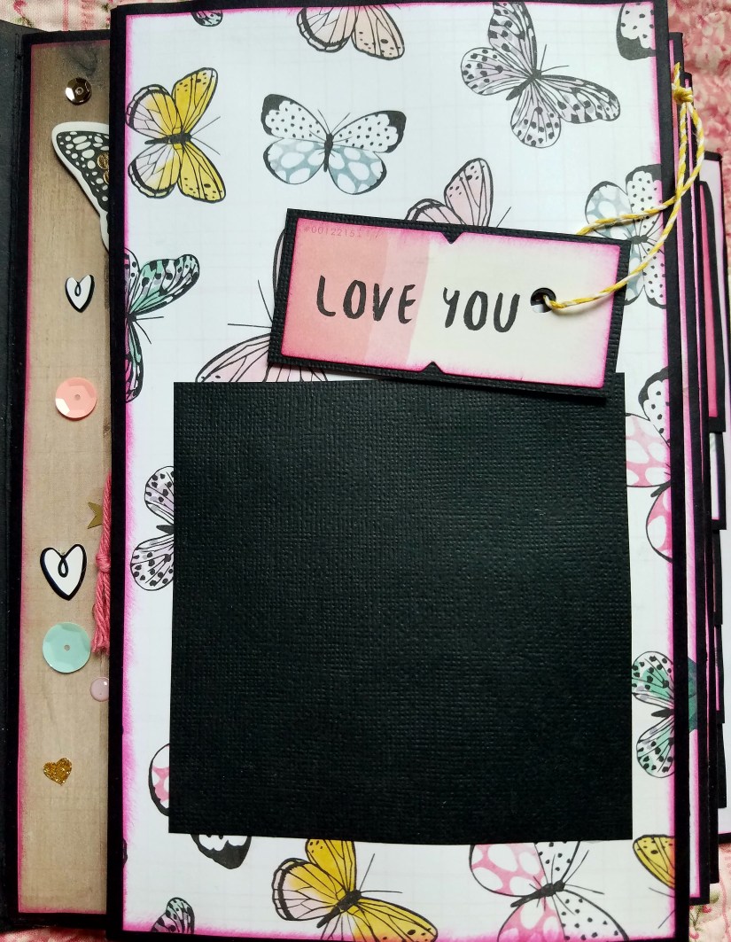
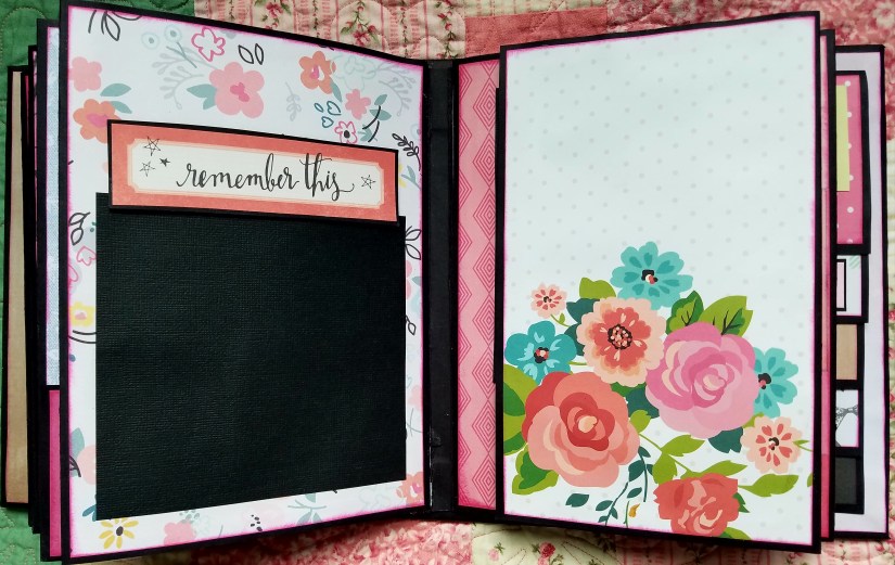
It opens up to reveal this page. I did a few up close photos of the tiny details. When it comes to scrapbooking; I’m all about the details. All of my journal cards are reinforced with black card stock. I glue cards to the black card stock and then cut around them with scissors. This helps to keep the cards from bending or tearing easily. It is time consuming, but I feel it’s well worth the extra effort. It just makes everything pop out with contrasting colors.


To the right of this page is the fold out shown below. . .

Page 4:
The black rectangle to the right is photo matte to place a picture. When you open this page up. . .
You see this. Anther photo matte to the right with a spot to the left for writing directly on the page. I found this lined scrapbook paper that works well with journal entries on the scrapbook paper. I added some embellishments to it. These lines are a really easy way to add some color to your scrapbooks. I use my scraps trimmings to do this and then glue them down next to each other sometimes overlapping in spots. I also like to add the stickers with words somewhere along the lines.

Page 5:
A photo matte to the left and a page that opens on the right. When you open this. . .
It opens to another photo page with a small pocket on the right.
Page 6:
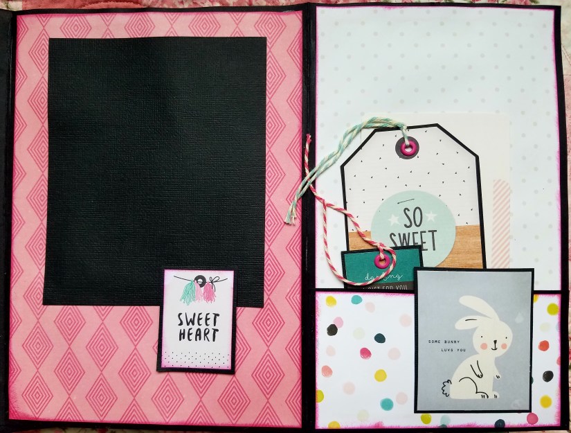
When I create pockets like this below, I try to use a patterned page along with a solid color that matches one of the colors in the pattern. For example: looking below on the left hand side, you can see a good portion of the page has confetti like dots. This is the pattern because it has multiple colors in it. Then I find paper that matches one of those colors. In this case, I selected pink for the face of the pocket. The pocket does have some pattern in it but it’s overall color is pink.
I like to think of it similar to dressing in the morning. Think of the top color as a patterned blouse and the bottom portion the pants. You wouldn’t put on poka dot pants with a striped shirt. You would try and choose a solid color for one either the top or bottom.

When you flip the page open it reveals this page. Love this little side pocket on the right. I added my card (with the doll) to the front of the pocket. When I do this, I will just glue half of the back and leave the other half alone. I just want to attach a portion of the card to the face of the pocket. This allows me to stuff things in this side pocket. Like shown below. I stuffed a black photo matte card in here for a picture that can be taken out of the pocket. 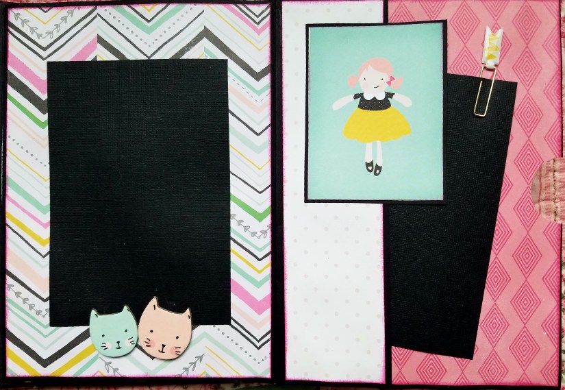
On the back of the last page I put another waterfall layout. The back page is always a good spot for these waterfall sections. They can sometimes take up a lot of room in your book and the back cover is a strong and durable spot to hold the weight of the paper. Each flap lifts up for more spots to write or put photos.


